Description
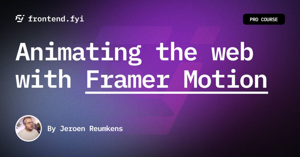
Crafting Beautiful Experiences With Framer Motion
The right animations breathe life into web pages, while over-the-top ones can be a distraction. In this course, I will teach you the perfect balance, diving deep into the world of meaningful animations.
You’ll learn not just to animate, but to enhance user experience gracefully. Your skills will not only slide to the next level – they’ll animate there, bringing a touch of elegance and functionality to every project!
Despite plain CSS getting more powerful every week, with amazing features like scroll driven animations, and view transitions, it still has its limitations. One of the biggest limitations is that you shouldn’t animate all properties of an element. For example animating properties like width, height, top, or left, could cause janky animations. It is best practice to manipulate an elements size and position by animation properties like translateX/Y and scale.
But why would Framer Motion do this any better than plain CSS?
Framer Motion packs some ✨ magic ✨, which they call Layout Animations. When using layout animations to resize an element in width / height, Framer Motion uses calculations under the hood, to convert this resize into a scale and transform animation ?. This results in animations that always perform significantly better than plain CSS animations — almost without needing to think about this!
It doesn’t only do this for width/height though!
However, this magic doesn’t stop at performant animations for width and height! Framer is even capable of animation really complex layouts from one into another. For example, animating two elements from flex-direction: row into row-reverse. Take a look at the magic in action below!
Last Updated 2/2024
Download Links
Direct Download
Animating the web with Framer Motion.zip (2.7 GB) | Mirror


